
The good, the bad and the ugly
The importance of typography in design whether it’s web design or graphic design should never be underestimated. I’m sure most if not all designers are guilty of committing typography sins, even if we won’t admit it.
The importance of typography in design whether it’s web design or graphic design should never be underestimated. I’m sure most if not all designers are guilty of committing typography sins, even if we won’t admit it.
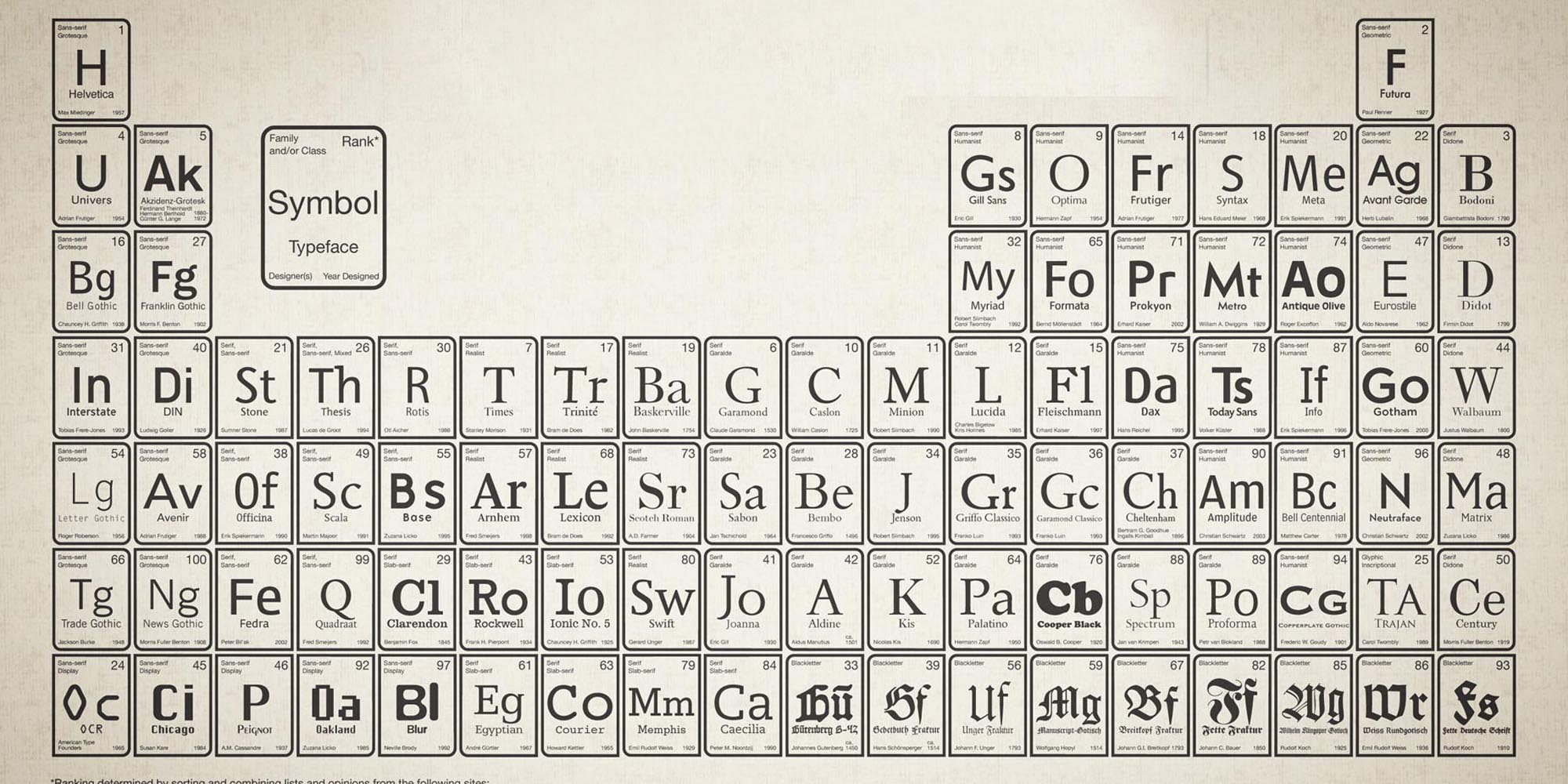
So I suppose it’s down to personal opinion which fonts we consider to be in each category. Here at Sync’d Design we have selected a few fonts, some good and some not so good. We would love to know if there is a general consensus?
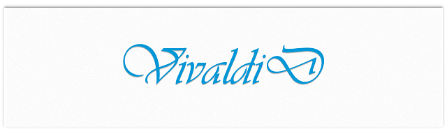
This is the ultimate font choice in luxury design, with its elegant and distinct style it is the perfect font for party and wedding invitations.
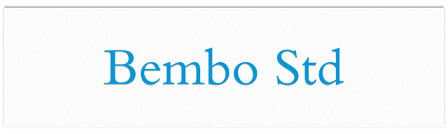
A good book face, this font expresses classic beauty and was used in The Rough Guides series of travelers books.
A font used alot in magazines, journals and books. An exceptionally legible font at great distances. Apple used this font on many of their keyboards for the keycaps.
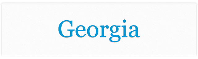
Designed for clarity on computer screens, even at small sizes and sometimes mistaken for a heavier Times New Roman. Georgia is a clear, robust font perfect for printing newspapers.
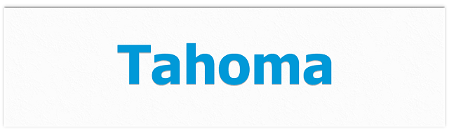
Good for technical material as the uppercase ‘I’ is distinguished from the lower case ‘i’. The font has been used on Skype, windows 2000 and XP. Like Georgia this font was designed for clarity on a screen, rather than print.

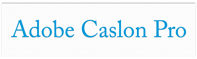
Trajan is used in many film posters, Trajan Bold was used in the film poster for Titanic. An all uppercase typeface because lowercase forms were not used in Roman times. At Sync’d Design we combine Trajan with Bembo as a lowercase alternative.

Seems to be common place in most student newspapers world wide. Its bad letter forms make this a font to steer clear of.
A firm favourite to casual computer users and amateur designers, way over used which is one of the contributing factors why designers hate it.
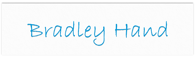
A script font ment to give a hand written style. Fans of this font could include teenagers and school teachers.

Similar to Bradley hand, reminds me of homemade party invites.
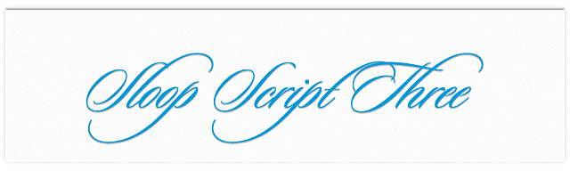
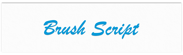
Snobby dinner party menu, or over use on wedding invites? Try using sloop instead.
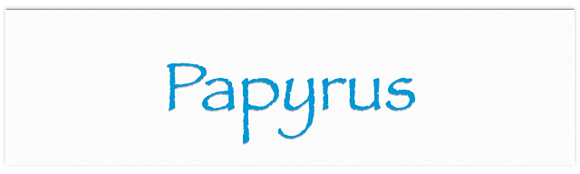
Gives your High school project that Egyptian theme. This font is also over used in the gift shop industry.
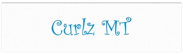
A font used in the Go Compare advert need I say more? reminds me of a Mexican restaurant menu.