The 7 types of logos
Logos are a combination of typography & illustrations, each type of logo design gives your brand a different feel. A logo is usually the first thing customers see, so make sure it represents your company.
Logos are a combination of typography & illustrations, each type of logo design gives your brand a different feel. A logo is usually the first thing customers see, so make sure it represents your company.
Here are the 7 types of logos you need to know about:
Monogram / Lettermark
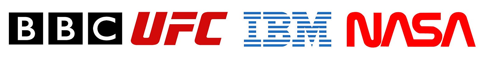
is a typography-based logo that’s comprised of a few letters, usually the company initials. The lettermark is all about simplicity. By utilising just a few letters, lettermark logos are effective at streamlining any company brand if they have a long name. For example, how much easier is it to say and remember BBC vs “British Broadcasting Corporation”?
The focus is on initials, the font you choose (or create) is very important to make sure your logo is not only on-theme with what your company does, but also legible when you print on business cards. Also, if you’re not an established business already you may want to add your full business name below the logo so people can begin to learn who you are right away.
Wordmarks
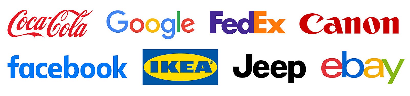
Similar to a lettermark, a wordmark or logotype is a font-based logo that focuses on a business’ name alone. Think Visa and Coca-Cola. Wordmark logos work really well when a company has a succinct and distinct name. Google’s logo is a great example of this. The name itself is catchy and memorable so, when combined with strong typography, the logo helps create strong brand recognition.
Also, like with a lettermark logo, typography will be an important decision. Since the focus will be on your name, you’ll want to pick a font or create a font that captures the essence of what your business does. For example, fashion labels tend to use clean, elegant fonts that feel high-end, while legal or government agencies almost always stick to traditional, “heavier” text that feels secure.
Pictorial marks or logo symbols
A pictorial mark (sometimes called brand mark or logo symbol) is an icon or graphic-based logo. It’s probably the image that comes to mind when you think “logo”: the iconic Apple logo, the Twitter bird, the Nike tick. Each of these companies’ logos is so emblematic, and each brand so established, that the mark alone is instantly recognisable. A true brand mark is only an image. Because of this, it can be a tricky logo type for new companies, or those without strong brand recognition, to use.
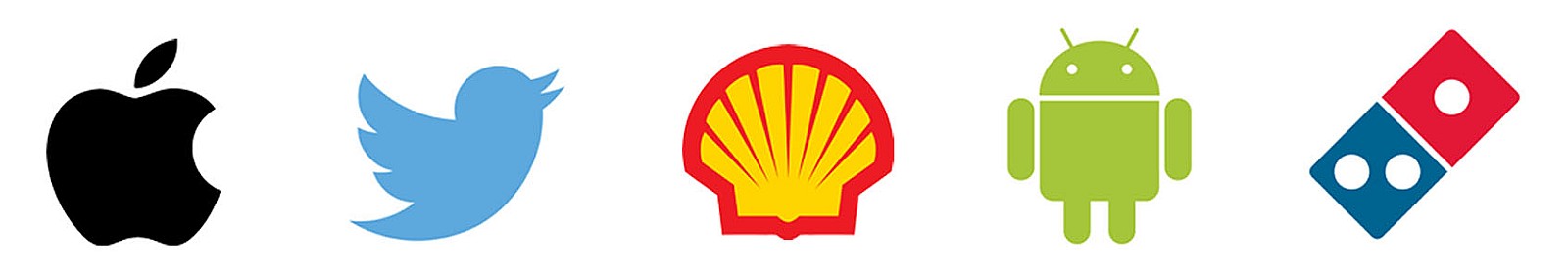
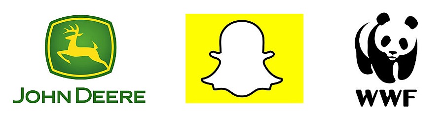
The biggest thing to consider when deciding to go with a pictorial mark is what image to choose. This is something that will stick with your company its entire existence. You need to think about the broader implications of the image you choose: do you want to play on your name (like John Deere does with their deer logo)? Or are you looking to create deeper meaning (think how the Snapchat ghost tells us what the product does)? Or do you want to evoke an emotion (as the World Wildlife foundation does with their stylised image of a panda)?
Abstract logo marks
An abstract mark is a specific type of pictorial logo. Instead of being a recognisable image like an apple or a bird, it’s an abstract geometric form that represents your business. A few famous examples include the BP starburst-y logo, the Pepsi divided circle and the strip-y Adidas flower. Like all logo symbols, abstract marks work really well because they condense your brand into a single image. However, instead of being restricted to a picture of something recognisable, abstract logos allow you to create something truly unique to represent your brand.
How many do you know of the above?
The benefit of an abstract mark is that you’re able to convey what your company does symbolically, without relying on the cultural implications of a specific image. Through colour and form, you can attribute meaning and cultivate emotion around your brand.
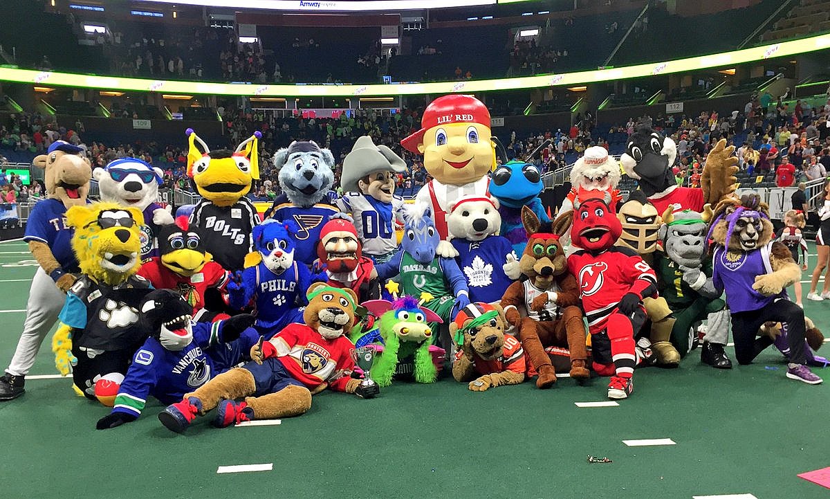
Mascots
Mascot logos are logos that involve an illustrated character. Often colourful, sometimes cartoonish, and most always fun, the mascot logo is a great way to create your very own brand spokesperson—er, spokes-character(?).
A mascot is simply an illustrated character that represents your company. Think of them as the ambassador for your business. Famous mascots include the Michelin Man, KFC’s Colonel and co co pops monkey. Mascots are great for companies that want to create a wholesome atmosphere by appealing to families and children.
The Mascot based logos are especially prolific in American sports such as American football (NFL)
The combination mark
A combination mark is a logo comprised of a combined wordmark or lettermark and a pictorial mark, abstract mark, or mascot. The picture and text can be laid out side-by-side, stacked on top of each other, or integrated together to create an image. Some well known combination mark logos include Doritos, Burger King and Lacoste.
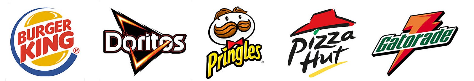
Because a name is associated with the image, a combination mark is a versatile choice and my personal favourite for the following reasons. With both the text and icon or mascot working together to reinforce your brand, a combination mark, people will also begin to associate your name with your pictorial mark or mascot right away! In the future you may be able to rely exclusively on a logo symbol, and not have to always include your name. Also, because the combination of a symbol and text create a distinct image together, these logos are usually easier to trademark than a pictorial mark alone.
Another benefit is this style of logo can lend it self to a wider range of formats and sizes. Social media logos are square or round, which does not lend itself to longer Wordmark logos. By adding a pictorial mark, abstract mark, or mascot, you add flexibly such as; Microsoft, Dropbox and Bluetooth

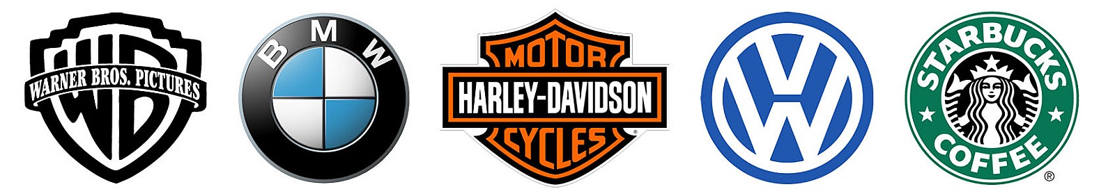
The Emblem
An emblem logo consists of font inside a symbol or an icon; think badges, seals and crests. These logos tend to have a traditional appearance about them that can make a striking impact, thus they are often the go-to choice for many schools, organisations, sports teams or government agencies. The auto industry is also very fond of emblem logos such as Porsche. While they have a classic style, some companies have effectively modernised the traditional emblem look with a logo designs fit for the 21st century… think of Starbucks’ iconic mermaid emblem, or Harley-Davidson’s famous crest.
But because of their lean towards higher detail, and the fact that the name and symbol are rigidly entwined, they can be less versatile than the aforementioned types of logos. An intricate emblem design won’t be easy to replicate across all branding. For business cards, a busy emblem may shrink so small before it becomes too difficult to read. Also, if you plan on embroidering this type of logo on hats or shirts, then you’ll really have to create a design that is on the simple side or it just won’t be possible. So as a rule keep your design uncomplicated and you’ll walk away with a strong, bold look that’ll make you look like the consummate professional.